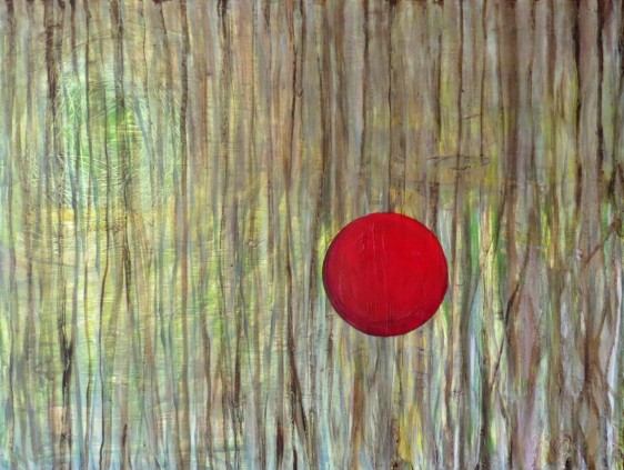
The background image was less a completed painting, more of a thought; set down a few years ago as I worked on another project, focusing on a woodland area I know. The sphere was added for no other reason than something which seemed necessary to complete the image – an instinct, I guess.
For me there’s something interesting in a blend of the real and the abstract, which creates a surreal place. If, (I think it was Simon Schama’s explanation which first resonated with me) a landscape is a place we situate ourselves within, then this kind of place, with one foot in the real world and another in the imaginary, is somewhere I like to float – and to which I often return.
There’s a value in keeping a painting one isn’t satisfied with and reworking it much later, out of context. Relating to the way that I work, a couple of years later on, I find the once intense relationship with subject and object is mellowed, time’s taken its effect and there’s room to add another dimension – sometimes literally.
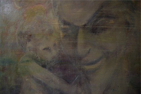
Made from a photograph taken during an encounter with a statue in the grounds of a chateau in northern France. Half worn away by weather and time, the statue depicted a Pan-like figure with a small Cupid on his shoulder with them seemingly sharing a moment of conspiracy. Maybe some classical storyline; maybe a representation of the beauty of the grounds (Pan pastoral; Cupid love); or maybe some totem for the possibility of love within its boundaries?
Viewed from a 21st century British eye however, there was another way of viewing it – a creepy old goat fella, like the devil, with a baby on his shoulder.
Search online and you’ll see Greek mythology sites speaking of Pan as a Greek god of the pastoral – worshipped in the wild, of wild countryside and woods. Other sites, some I wouldn’t care to delve into any further, claim Pan as a symbol for the devil and all sorts of evil behaviour.
Rather than paint it as a direct image from the photograph, I thought of this duality as I worked, also how meaning is lost in time and reimagined. It’s painted more figuratively underneath but has been veiled, with stone and lichen-like overgrowth pushing it away from clear view.
It’s hard to quote examples of paintings which have spoken to me and inspired me over the years. I didn’t visit art exhibitions as a youngster and stand and stare at great paintings, bowled over and inspired to be an artist for ever more, as other artists sometimes recall – my family weren’t art buffs and fine art of any sort didn’t feature in my life until I pursued it. But I remember one painting which stuck with me. It was in a little private gallery where my parents were looking at something else. We children had been taken inside, grumbling probably, as they talked to the owner. But this one painting took my attention. It was a picture of an old silver-barked tree lit up by the sun against one of those stormy, navy blue skies which appear just before the rain arrives. It was one of those skies which still make me stop what I’m doing and reach for my camera or just stare and enjoy. (It’s particularly effective in the Cotswolds where the yellow stone buildings look spectacular against the dark blue).
While I painted this little image, I was able to take time to remember that painting. I have no idea who the artist was and I’m sure it was no particular ‘great painting’ but it inspired me as much as anything in the great galleries of the world.
Many years later and I know that the painting wasn’t a picture of a tree at all, it was a picture of light. Someone was doing what I was doing here – grabbing a moment and trying to save it and remember it.
This is another oil on 12in squ wooden board. Painted from a photograph taken from my front window on one such day when a camera was nearby during one of those moments when I was lucky enough to look out as the scenery changed dramatically.
This little sketch doesn’t really do justice to the light, apart from giving me some time to pause and think about it. I’ll paint more of these one day.
Just some search results after Googling ‘tree against a stormy sky painting’ (the fourth one along is most like the light I’m talking about)
Works of art are the by-products of the imagining being; In daydreaming, we experience immensity – Gaston Bachelard The Poetics of Space*.
“Immensity is within ourselves. It is attached to a sort of expansion of being that life curbs and caution arrests, but which starts again when we are alone. As soon as we become emotionless, we are elsewhere; we are dreaming in a world that is immense. Indeed, immensity is the movement of motionless man. It is one of the dynamic characteristics of quiet daydreaming.”
*Bachelard, G. and Jolas, M. (1992) The Poetics of Space. Boston: Beacon Press. p184)
[Having just had a little operation and spent a time in a hospital/sick bed, largely both emotionless and motionless, this idea of wandering in immensity seems paticularly apt to me just now. cm 24/8/16]
After yesterday pondering competition amongst artists and the cost: Are open competitions good for healthy rivalry? Is it just the lauding of the most fashionable and the crushing of the rest? A vital way of funding galleries, bursaries etc? An essential business cost for an artist or a waste of money?
When I get notified of someone ‘liking’ a post, I often have a little peep to see who it is. I was very glad I peered at this page by Fritz because it introduced me to a poem by US writer and environmentalist Wendell Berry. Well worth sharing again (with many thanks!):
Timelessly beautiful – unfurling fern fronds in a puddle of sunshine in an old English wood.
That’s what made me reach for my camera when I took the photograph which inspired this oil painting. And that’s what I was thinking of as I painted it. Sunshine dazzling its way though the canopy and lighting up details by turn, as if the wood was proudly showing off its treasures to its inquisitive visitors.
The wood I visited has since become super-famous as a film set venue – Puzzle Wood in the Forest of Dean. It pops up in the new Star Wars film, in Merlin, in Doctor Who and I saw it the other night in the BBC’s The Living and the Dead (starring Merlin!). It’s instantly recognisable, with its mossy banks, and tree and limestone rock formations which have sheltered and delighted its human visitors at least back to Iron Age times.
For my painting (wooden board 12inx12in) I only primed the foreground. The background is a light oil wash, which also leaves the wood grain showing – it seemed appropriate for its subject. It took a long time to tease all the leaf shapes out of the undergrowth and it was surprisingly fiddly to paint the little fronds caught in the sun. But I like this little reminder of the smell of damp leaves; of the pools of warm sunshine in the cool woods and the life which is battling for space all around where our feet tread.
A moment of sunshine, of shadow, waiting for the school bus one day beside the road.
Shapes, lines, veins, pathways – a photograph of a tree which doesn’t feature a tree at all.
So, on its traces continue into oils on a wooden 12in square board, painted while clearly remembering the pink blossom on the apple tree, its knarled bark and those birdsong-filled first days of spring when the world comes alive and there is warmth in the air at last. Living on this cloudy isle, those moments when sunshine switches on the colour around you are good reason for a moment’s pause and appreciation.
This painting has been bleached out a little in its presentation here, which somehow gives me more satisfaction in reflecting my feeling of the time – maybe as a memory rather than a photograph. It is interesting to note that as well as developing ideas about painting, this exercise also provides a place to wonder about reproduction of paintings digitally and how the making of the paintings isn’t always the end of the story.
I’ve been noting lately how teenage girls are starting to make up their faces so they look good on camera, rather than real life (ie the recent big dark eyebrow phenomenon) and I guess this is some sort of similar principle.
Not sure whether I entirely agree with Jonathan Jones but it’s an interesting article about the selfie and the painter.
(I do, however, absolutely agree with one of the people who commented: It was my first thought too – I wouldn’t be in there, cleaning my teeth, while any bloke was on the loo!)
So. Everyday moments captured – or staged, narcissistic, superficiality?
“This portrait of the artist and his wife may be hugely popular on social media, but its intimacy and humanity – just as with a photographic selfie – is fake.”
“Apart from the fact it has been painted rather than snapped with a phone, this picture has exactly the same appeal as Kim Kardashian’s intimacies. Well, almost. It’s got the unbuttoned spontaneity that selfie culture celebrates – and the same deadening superficiality.
“The very thing that makes this painting an online hit is what makes it worthless as art: the fact that it sucks up to modern photography’s lowest common denominator. Some painters make brilliant use of photographs, transforming the images all around us into something more monumental and permanent…But instead of elevating photography into painting, Needham has lowered painting to the triviality of instantaneous self-portraituree.”
“Applied to painting, critical thinking too often ends up calling into question the very medium—a deconstructionist impulse that particularly sabotages beginning students. Playing baseball or tennis requires accepting the game as a whole, and so does painting. But unlike baseball or tennis, painting is an open-ended pursuit without any numerical victory or defeat. It’s fraught with subjectivity and uncertainty. It is, as an artist I know has said, one semi-mistaken brushstroke after another applied until a kind of truce against the possibility of a perfect painting is reached.”
Laurie Fendrich
“How critical thinking sabotages painting” – An interesting article on methods and thoughts on the teaching of painting in art schools. Read it via the great painting blog Two Coats of Paint.
I make no apology for the pun, I used to be a sub-editor!
It’s an English summer on a stick. A snail creeping across the damp roses.
This painting is back to a 12in square wooden board. It took ages, for no good reason whatsoever. What you can’t see on the photograph (only by yellowy smudges) is that I used varnish to shine the rain spots and the snail (and give a snail trail). Not sure that was the answer, but I do enjoy a variety of surface – perhaps that’s a special something which only those seeing it in real life can share?
NB: I’m posting here less frequently because I’ve started studying for an MA (Fine Art). Very glad I did too. Although it’s hurting my head a little and I have even less time that I had before, it means I’m thinking, challenging myself and being challenged too. Recommended to anyone wondering whether to take the step!
Following what seems to be a general theme of focusing upon the seemingly mundane, this little painting depicts a bit of roadside verge. If you’re familiar with this blog, you’ll know that this is a series of paintings which have been based upon (or mostly upon) those photographs one takes to use in the future.
I can’t remember taking the photograph that this was based on. One of millions (ok, thousands) I take as I wander about. This came up in discussion recently – I’m sure I haven’t coined the phrase ‘craft photography’ but that’s how I think of analogue photography (or it could apply to technically brilliant digital photography just as well) where a photograph is made, rather than taken. Time is spent on composition, lighting, atmosphere. Most of the time I’m not interested in ‘making’ a photograph. I ‘take’ them – the photograph is not the primary focus. I guess what I tend to generally do as I wander the world, while being more than a snap, is less ‘craft’ – like blinking and saving what you see to think about later. Aide-memoires I suppose. For my ‘files’ – which aren’t real but kind of are…!
I enjoyed this little examination of the leaves and plants amongst the stones (oil on 12inx12in wooden board). It made me think about how fortunate we are living in so fertile a place, that even the tyre-cut edge of a roadside, is sprouting and teeming with life. On the flip-side, it also makes me think about another theme I very often consider while I work with landscape – the opposite to the welcoming image of the pastoral – the endless fight against nature, and man’s efforts to tame the wild.
By the way – for some reason this painting was particularly difficult to photograph. It’s a really unexpectedly and infuriatingly difficult task to photograph a painting well – best advice is to hire a professional as it’s a particular skill, both in the photography and the pre-press stages. Coincidentally, I just got an email from US artist Owen Garratt (AKA The Pencilneck!) who shares his experiences of the commercial market in an online blog (Marketing Tools for Artists). Here he interviews Andy Derrick, Head of Artist Community at Artsquare on this subject- I know nothing about Artsquare I must stress and it seems a US service only in any case – but it’s an interesting discussion there seems some good advice amongst it.
There is a time in the late autumn, and sometimes way into winter snows, when the last of the leaves drop from the fruit trees and unpicked fruit is revealed. It’s almost eerie to see these fruits dangle without leaves; unchosen ones. They look cold, as if they’ve lost their coat. Some, like this one which caught my eye, have mutated or grown around their stalks – clinging on; trying to be part of the tree; battling against the inevitable.
This portrait of a lonely, cold apple now apparently speared by its branch (looks like a russet perhaps but could be a very old variety; the real-life version was in the garden orchard of Croft Castle in Herefordshire one November a few years ago) is painted on a portrait-oriented rectangular primed wooden board, for a change – 12 x 18in.
Not much more to say really, except that you can use that chubby fella as any metaphor you choose. Are you gripping onto your branch? Did you leap off to your fate? Did you ensure your attractiveness so you’d be snapped up straight away? What kind of apple are you as winter approaches? Is this a fruit of opportunity? Does it show dogged determination or avoidance of the things that matter (Try to take no notice of the chance occurrence that this painting has the most unlucky number of all!).
I think it was a little yellowhammer who visited our garden and I lazily photographed it up on a branch (the bird, not me). Maybe I leaned backwards from a chair in the lounge with the doors open and a sunny day streaming in.
Its memory is now imprinted on this board; a reminder of a time when its path crossed mine and its yellow chest was so bright against the blue sky.
It’s another 12×12 wooden board and just oil paint. Fairly quickly painted and not too far fussed over.
It’s better in the flesh; this further filter of viewing takes something away from the original, as is often the case. It is surprisingly and frustratingly difficult to photograph a painting well.
Of course, we’re all colluding in the illusion that it’s a painting we’re looking at but it is, in fact, a digital photograph of a painting uploaded, adjusted, here and downloaded there – dots viewed on screens. Print it out and it’s neither painting, nor photograph nor digital image. Just some ink dots on a page.
Another layering of images. A landscape from a photograph (mine), which became less figurative with the painting of it, and a tiger, which popped into my field of vision, online I think, during the time I was painting it. It is rare for me to use any other image that isn’t my own. This tiger image struck me by its colour perhaps, and I followed the thread of serendipity.
There is a border left bare on the wooden board (12″x12″) and the pale oil washes keep the wood grain running between border and painting. Looking back at it now prompts the same thoughts as when I painted it and I suppose some explanation as to why I stopped where I did: Have I painted a tiger in a field in Gloucestershire? There’s no shadow or imprint to connect him to the ground. Is he on another plane? Does he symbolise something? Why have I put him just there? Is that still a landscape now the ground drops away into brush strokes, now the leaves have been wiped away?
It is – and is always – just some paint, arranged.
From Gerhard Richter ‘A Life in Painting’[Dietmar Elger – English translation, University of Chicago Press, 2009]
“During the 1972 Venice Biennale, Richter tried once more to explain why photography had come to mean so much for his painting.
“ ‘Because I was surprised by photography, which we all use massively every day. Suddenly I saw it in a new way as a picture that offered me a new view, free of all the conventional criteria I had always associated with art. It had no style, no composition, no judgement. It freed me from personal experience. For the first time there was nothing to it; pure picture.’
“The dialogue between painting and photography is as old as photography itself. The fearful predictions of the French history painter Paul Delaroche, who believed that photography would be the death of painting…never quite came to pass, though there is no question that the two mediums have competed and profoundly affected each other in both theory and practice. It was not long after the invention of the photograph that the medium took on and even bettered some of the functions of painting; whether in portraiture, the recording of cityscapes or scientific illustration, it at least seemed to offer greater objectivity and precision….
“In fact, the practice of photography served to embolden painting, even helping to pave the way to abstraction.”
… “As many have noted, artistic engagement with photography has prompted or inspired all sorts of critical questions regarding objectivity, manipulation, authenticity and cliché in photographic perception, aura and its loss as a result of unlimited mechanical reproducibility and the suggestive potential of photographs as reproduced images in the mass media.”
…“As an artist in the 1960s, Richter did not question the objectivity and authenticity of photography itself (this in a day before digital imaging). Indeed he has always worked to transfer the attributes and vocabulary of photographs into painting. He said in a 1972 interview with the journalist Rolf Schon:
“‘I’m not trying to imitate a photograph, I’m trying to make one. And if I disregard the assumption that a photograph is a piece of paper exposed to light, then I am practicing photography by other means; I’m not producing paintings that remind you of a photograph but producing photographs.’
“Richter intends on the one hand to undermine representation painting but on the other hand, to rescue it from the turbulent discourse surrounding artistic practice during the second half of the twentieth century…he transfers the fundamentals of photography, a relatively unburdened medium to the painted representation.”
It’s a daisy – just a simple little homage to the gloriousness of tiny things.
10/100 Daisy
Is there anything more jolly than a little bobbing daisy in the grass? Petals pure velvety white with a soft, yellow, pollen-rich centre – opening its happy face to the sun and then showing its shy pinky underside as it closes up for the night?
Stomp on them, mow them down; they reappear with their unfailing little summertime smile.
I was also playing with my paint, as with all in this 100 series. The (12in sq) wooden board grain remains under light wash, leaving, with green-ness, just a hint of a grassy background (but not). Layers couldn’t reach the unachievable whiteness but there is a certain impasto, 3-d effect from the effort, which also expresses the ridges of the petals.
Another of the greatest reasons to paint, or to draw, is to look closely and consequently think closely, about something which has grabbed the artist’s attention.
The painting therefore, even if not considered a superior image to the original photograph, has performed a function for the artist. I guess the hope would be that it would perform the same function for an audience – leaving aside any personal connection the flower might bring – a little musing upon on the humble lawn daisy. More so than the photograph? If someone has gone to so much trouble to lay the image down in oil paint, is it imbibed with greater significance? Might that significance lead one to consider the subject more so than an aesthetic admiration alone?
Jeannie Brown, a professional painter and print-maker based in Malvern, Worcestershire, has kindly taken a moment to think about and put into words how she uses photographs in her work, specifically in terms of their part in a process leading towards an abstract image.
The painting shown above is Jeannie’s ‘City 2’ (2013, oil, acrylic & graphite on board 80cm x 80cm).
Below is her painting ‘Danny’ with which she won a prestigious competition last year (Oil, Winner of Coventry Open 2014).
The use of the photographic image in my abstract work
My interests are mainly in the urban environment and I use photography as a way of making a connection with that environment.
My subsequent interpretation of that environment using the photographic image I find invaluable. The camera acts as a mediator between the photographic image and the work.
The photograph is an abstract image in itself, taking the three-dimensional into a two-dimensional flattened form. Every colour, tonal value or shape becomes a device for abstraction – this in turn fulfils my desire for systematic formulation of pattern and order and the subsequent connection to that society.
Ian Hamlin ‘Wednesday Conversations’ – oil on canvas 40x120cm
On seeing that New Zealand artist Ian Hamlin had ‘liked’ one of these posts, I took a tour around his site and had a nosey at his paintings, which are photo-real in nature, although containing a vibrancy and depth/sense of colour which a camera perhaps couldn’t convey. I was curious how he viewed/used the photograph within his work and cheekily asked him if he could tell me, to add to my discussion here. He’s been generous enough to respond and share his views and experience, and here’s his reply, below, for you to enjoy. I hope it’ll be the first of many points-of-view.
Ian Hamlin’s a professional artist of some 40 years experience and a member and former president of the New Zealand Academy of Fine Arts – I’m hugely grateful to him for taking the time to talk to me from across the other side of the world. Please have a look at his work/follow his blog at http://ianhamlin.co.
BTW (always following coincidences) I find I’m very appropriately beginning this conversation on a Wednesday, having picked out the painting above as one of my favourites on Ian’s site. It was the colour which drew me to it – and adding to my last post about phyical effects of colour, the combinations here almost make my heat beat faster. I almost have to look sideways at it; it dazzles me.
Iam Hamlin, 2015:-
“I make it a point to ALWAYS use my own photographs. If someone offers me a photo to paint from as a commission I will still go there myself. This also means it doesn’t then have any copyright implications in using someone else’s.
Most importantly there is so much sensory information gathered by actually being there to take the Photo that is not recorded by the camera. So a huge part of the process for me will be unavailable if I don’t have the experience of being there at the time. This can be negated somewhat if I am familiar with the location/subject but I learnt early on that the painting will flow a lot easier if it comes out of my own impressions and experience of the place and time.
Also it’s important to have a number of different views (photos) of the subject which you can combine into your composition. It’s rare that a painting is derived from a single photo. The photo is rarely the perfect composition, lighting or both, and usually includes a lot of extraneous detail that is easy to get bogged down in. These details are spontaneously left out on site if working directly on location due to having to work more quickly.
The photos are really only the starting off point for the painting which can often take a completely different trajectory as it evolves through the creative process. It is easy to become a slave to the photo and I always encourage my students to focus on their internal impressions, feelings, memories and take their cues from the emerging painting rather than leaning too heavily on the photographic image – which is only telling half the story.
In terms of light and colour the artist has the opportunity to creatively include a lot of the colour/light spectrum that is not captured by the camera. This is important in creating a sense of spacious aliveness that is much more difficult to achieve in a photograph without a lot of photoshopping etc.
One of the main advantages of using photos is that it can allow you to take your time, so it is not a race against the changing light and weather conditions. This is quite a factor here in New Zealand where our weather is very changeable, and the wind can make painting on location a challenge in itself!
I’ve also found that using photos can help with spontaneity in the painting process, it means that most often I don’t need to complete a number of preliminary sketches etc which can result in the final work retaining some of the freshness of the original inspiration.
As I’ve said above the painting should always add an emotional tone and felt quality of space and the artist’s personal experience to the photograph. To take the viewer to another place, beyond a record or representation of the setting.”
If you’re an artist reading this, do join in the discussion and have a think about your own relationship with the photograph. You can email cmorrises@gmail.com.
A narrowboat scene. It’s from a photograph taken in Honey Street, near Avebury, Wiltshire. We were moseying along the canal; how beautiful it was. How relaxed we were. We may have had a drink at The Barge, we were exploring. It was sunny. It was all good.
What caught my eye about the actual scene were the reflections – how the bridge formed a complete oval and the narrowboat was reflected.
A 12in sq board was already prepared, primed with white acrylic, giving a shiny, skiddy surface. Acrylic ink was used to lay down the shape of the canal. Yellow ink, running and dripping about. And it was worked from there with oils. Again, I was working loosely and quickly.
It’s yellow and blue and white with bits of green. Can’t say why. There’s no reason; I was just playing. I just did it. It gives a different sort of light. It seems to clash around horribly, yet that’s not such a terrible thing either. It’s a bit odd on the eye. I don’t like it in my imagination but I like it better when I look at it, even though its colours actually make me feel a little bit queasy. I wonder if anyone else finds that some colours make them feel strange?! It reminds me of when I was pregnant and I had to abandon plans to paint my bedroom ‘spicy’ colours because they made me actually feel sick and I couldn’t look at them. I was suddenly drawn to florals!! (I got over the ‘Laura Ashley’ stage without, thank goodness, re-papering the house!).